Description
BreakColorUI Dropdown Button
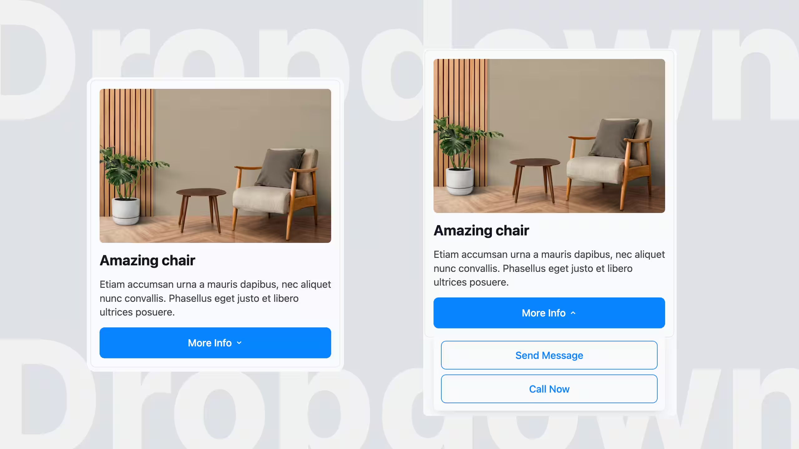
A custom Breakdance element that adds a styled dropdown button to your site. Click (or hover) the button and a floating panel opens with whatever you want inside — links, a mini menu, a sign-up form, an image, anything you can build in Breakdance.
Requires: WordPress 6.0+ and the Breakdance Page Builder.
What it gives you
– A drag-and-drop Dropdown Button element inside Breakdance, listed under Other.
– Click or hover to open — pick whichever feels right for your site.
– The panel is floating — it never pushes the rest of the page around when it opens.
– Anything goes inside — drop other Breakdance elements into the panel like you would in any container.
– Full Design tab styling for both the button and the panel: typography, colours, borders, padding, background, icon, chevron, shadow.
– Smart close behaviour — closes when you click outside, and optionally closes when you click an item inside (handy for menus, off for forms).
– Fully responsive — set values per breakpoint (Desktop / Tablet / Mobile) and they cascade naturally, just like every other Breakdance element.
– Automatic updates — new versions show up in your Plugins → Updates screen, no manual ZIP juggling.
Install
1. Download the latest ZIP from the Releases page (look for breakcolorui-dropdown-button-vX.Y.Z.zip).
2. In WordPress, go to Plugins → Add New → Upload Plugin and pick the ZIP.
3. Click Install Now, then Activate.
4. Open any page in the Breakdance builder — the Dropdown Button element is now under the Other category, ready to drag in.
That’s it. Future updates arrive automatically through Plugins → Updates.
Using it
Build the button:
1. Drag Dropdown Button onto your page.
2. In the Content tab, set the button label, pick an icon if you want one, and choose click or hover as the trigger.
3. Drop any Breakdance elements you want into the panel — text, links, menus, a form, images, columns…
Style it:
In the Design tab you’ll find two sections:
– Button — controls the trigger button (size, alignment, typography, normal / hover / open background colours, borders, padding, icon size, chevron, etc.).
– Dropdown Panel — controls the floating panel (width, min / max width, background, padding, borders, shadow, layout, typography colours for headings, text and links, plus the gap between the panel and the button).
Set values on Desktop and they propagate down to Tablet and Mobile automatically. Override only the values you want to change at smaller breakpoints.
Behaviour options:
– Trigger (default Click): Switch to Hover if you’d prefer the panel to open on mouse-over.
– Close on outside click (default On): Click anywhere outside the panel and it closes. Turn off if you want the panel to stay open until the user re-clicks the button.
– Close on child click (default Off): Turn this on for menus (so clicking a link inside closes the panel). Leave it off for forms or any panel where the user needs to keep interacting after a click.
Updates
Once installed, new versions appear under Dashboard → Updates and Plugins → Installed Plugins like any other plugin update — just click Update Now.
If you don’t see an update you expect, click Check Again on the Updates screen.
Updates are automatically skipped on local development environments, so they don’t get in the way while you’re building.